What has your website done for you lately? Has it brought in new customers, engaged existing ones to make more purchases, or helped you to continue to grow your business?
If the answer is no, then maybe the next question should be, what have you done for your website lately?
Maintaining and improving the overall design of your website is vital to growing your business. User experience is integral to the satisfaction and engagement of your website visitors. So if you haven’t paid much attention to your UX lately, this is definitely the time!
Let’s take a look at what good UX is focusing on this year, and how you can up your UX game with your own website.
Declutter Your (Web) Space
This is a great tip not only for organizing your desktop. It will work very well for the improvement of your website UX, too.
A site without enough negative space, or white space, is much harder to navigate. It also tends to affect the overall aesthetic appreciation and emotional response from the interaction with your brand.
To improve website performance, it is recommended to allow for plenty of white space within the formatting and layout of your website. Don’t clutter it up with too many images or too much content; make it simple, easy to navigate, and pleasant to look at.
Craft Effective Calls To Action
Calls to action, or CTAs, have been the source of the long-standing debate. You can’t ignore them, because not using CTAs will make the actionable part of your websites unclear or difficult to follow through. Nor do you want to use too many of them, because no one is pleased to be pushed into doing something by the multiple haunting “Act now!” messages.
To create a user experience that is both pleasant for the user and effective for you as the website owner and webmaster, find the sweet spot between the occasional use of directive CTAs (such as “Act now!” and the like) and more subtly crafted, in-text CTAs that explain the benefit of acting now.
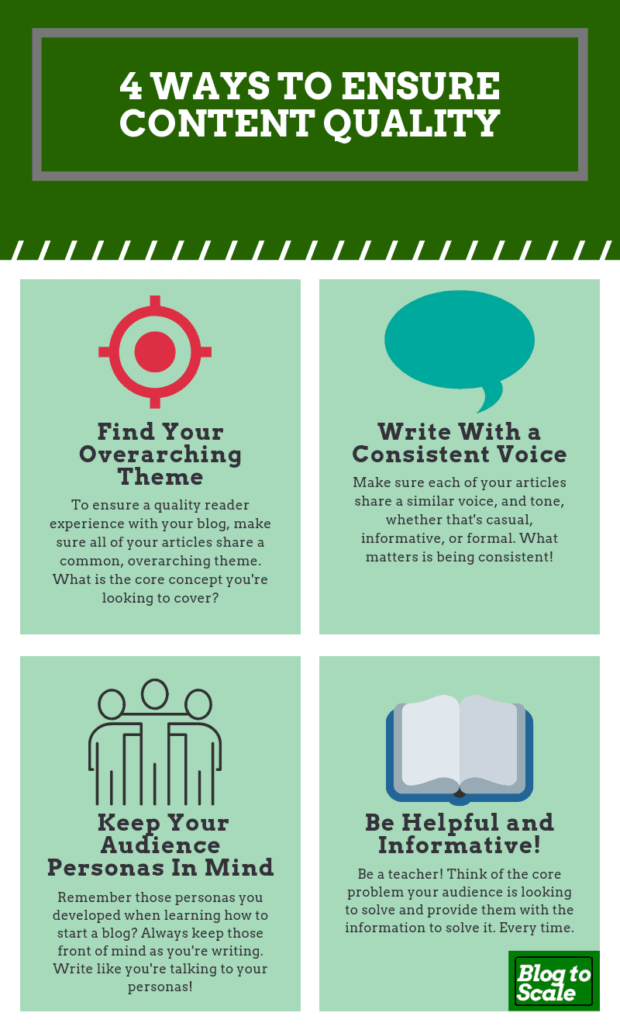
Keep Content Quality Consistent
It is extremely important not to make your visitors feel like they’re wasting their time browsing through your website.
This is a problem that I’ve run into with some of our clients: some of their content is okay, some are great, and some are quite lousy. In short, their content is hit or miss.
It is important to realize that internet users look for content that is reliable, accurate, informative, entertaining, and worth sharing with others. They may visit your website to read a good article, look at a few less-stellar others, and quit without further exploring your site.
It’s absolutely necessary to curate your website content. Regardless of whether it is a text, videos, or images, set high standards and stick to them.

Source: Blogtoscale
Get Creative with Your Images
Speaking of images, one of the things that tend to bother internet users is when an illustration doesn’t do its job. For instance, it’s pretty common to use free stock photos selected in a few minutes. Or they may be so commonly used that they’re seen on many similar websites.
For best UX, use unique images and brand them. This means everything from getting responsive e-commerce website logos to your product photos. Make sure that your images correspond with other content on your website.
Format Your Articles Properly
This is another typical UX problem that also affects your search rankings. Google gives priority to more readable articles, which means also appropriate formatting and good layout.
If you are using WordPress, you can use specific plugins that help you to control the technical quality of your publications. They can alert you if you didn’t include enough subheadings, or if there is too much content within a certain paragraph.
Great texts are not enough, because the proper formatting enhances the overall user experience and improves the takeaway from the site.
Post Regularly
Keeping your site full of fresh, usable content is an important factor for search engine algorithms, but it’s also a valuable part of the user experience.
Internet users are looking for content that is fresh, accurate, and useful. If you can provide what they’re looking for, you’ve nailed the essence of UX.
Website UX 2020: Best Year Ever!
As web designers, owners, and webmasters, we are always on the lookout for ways to improve the user experience.
As these highlighted areas have shown, it doesn’t have to be rocket science. Sometimes it’s just a matter of rearranging, decluttering or simplifying what you already have, and that’ll be enough to boost your UX for the new year.
Author Bio
Phil Eisenberg’s works at a local IT firm. His best skills include writing engaging articles, developing content strategies, and planning digital marketing campaigns. He likes to play the guitar and brainstorm new ideas for his clients.


